Engineering: Archive
A record of projects, talks, and writing from across the years.
Projects
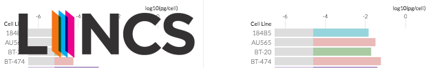
Cancer Browser (2016)
Interactive visualization of breast cancer cell line datasets for Harvard Medical School's LINCS database. With Peter Beshai, Jim Vallandingham & Bocoup DataVis.

Learn JS Data (2016)
A guide to manipulating and preparing data using JavaScript and d3.js. With Jim Vallandingham & Bocoup DataVis.

Bl.ocksplorer (2014 – present)
A d3.js block search tool that surfaces API usage examples by scanning and cataloguing a growing list of user blocks.

MobileVis (2014 – 2015)
A collection of examples and patterns for data visualization on mobile devices. Supported by the Knight Foundation Prototype Fund.

NPM by Numbers (2014)
A visualization of the npm ecosystem as of September 2014 — exploring version numbers, dependents, package age, and maintainer counts.
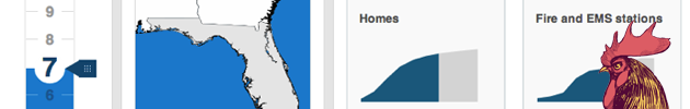
Surging Seas Risk Finder (2013 – 2014)
An interactive, data-driven tool demonstrating sea level rise risk across geographies and categories in the US. With Bocoup DataVis.

The Miso Project (2012 – present)
An open source toolkit for high-quality interactive storytelling and data visualization. Collaboration between Bocoup and The Guardian Interactive Team.
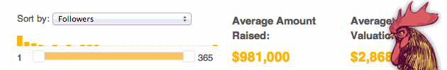
Startup Data Trends (2012 – 2013)
A tool to browse publicly visible startups on AngelList, filterable by location, market, followers, and funding signals.

The Business of US Food Aid (2012)
An interactive piece for The Guardian exploring how nearly $1bn in US food aid contracts were distributed. With Claire Provost, Nicola Hughes & Alex Graul.
Somalia Famine: How the World Responded (2012)
An interactive piece for The Guardian exploring the Somalia famine through donor behavior and media coverage. With Claire Provost, Nicola Hughes & Alex Graul.

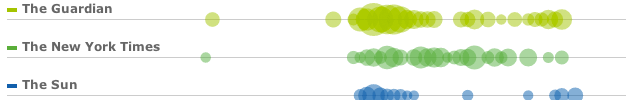
NYTWrites (2011)
A visualization exploring the writing patterns of New York Times journalists — topic breadth, authorship, and the shifting nature of journalism.
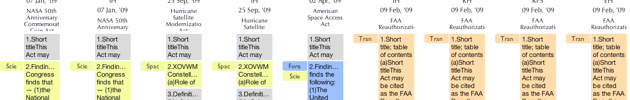
Many Bills (2010 – 2011)
A web-based visualization making congressional legislation easier to digest — bills organized into sections, color-coded by topic, with outlier detection.
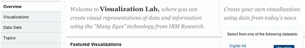
New York Times Visualization Lab (2008 – 2009)
An experimental adaptation of Many Eyes for The New York Times, allowing readers to visualize and comment on datasets from Times editors.

A Day of MBTA (2009)
An interactive visualization of MBTA commuter traffic patterns across lines and stations over a single day, built for the Massachusetts EOT Visualization Challenge.
Talks
Slides often available on Speaker Deck.
2017
-
Visualizing the health of the Internet with Measurement Lab
Strata Data Conference — London, UK · May 25 -
Visualizing the health of the Internet with Measurement Lab
Open Data Science Conference — Boston, MA · May 4 -
Discussion about Data Visualization [breakout]
Women in Data Science — Palo Alto, CA · March 5
2016
-
Text is data! Analysis and visualization methods
Plotcon 2016 — New York, NY · November 15 · Video -
D3 V4, What's New?
Boston DataVis Meetup — Boston, MA · August 2 -
Bringing together User Centered Design & Data Visualization
Hadoop + Strata — San Jose, CA · March 31
2015
-
Best Practices for Releasing and Choosing Open Source Projects
Grace Hopper Conference — Houston, TX · October 15 -
Making pictures, 1000 words at a time
Women in Data Science — Palo Alto, CA · November 2 · Video -
Making pictures, 1000 words at a time
Intersections 2015 — New York, NY · May 29 -
Common data visualization patterns and pitfalls with d3.js
London JS Conf — London, UK · February 12–13
2014
-
Building Web Applications [workshop]
Roost — Chicago, IL · September 10–11 -
Building Web Applications with Backbone [class]
Roost — Chicago, IL · July 7–8 -
Building Data Visualization with d3.js [class]
Bocoup — Boston, MA · April 10–11 -
Code Architecture with d3.js [keynote]
d3.unconf — San Francisco, CA · March 30 -
Introduction to d3.js
NICAR 2014 — Baltimore, MD · February 28 -
Building Web Applications [workshop]
Roost — San Diego, CA · February 10–11
2013
-
Keeping the YouTube Generation Engaged with Rich Media, Visualization & Animation [panel]
Grace Hopper Conference — Minneapolis, MN · October -
Interactive Storytelling [talk + workshop]
Chicas Poderosas — Costa Rica · July 10–13 -
Data in your Browser?!
Boston JavaScript Meetup — Boston, MA · June -
The ABC of Data Visualization [keynote]
Fluent Conf — San Francisco, CA · May 29 -
Visualizing Data (Responsibly) [keynote]
Takeoff Conf — Lille, France · January 18 · Video
2012
-
Building Better Apps with Client-side Data
JSCamp.Asia — Singapore · November 29–30 · Video -
Bringing Data to your Client-Side Apps
JSConf EU — Berlin, Germany · October 6–7 · Video -
Data in Your Browsers?! Building Better Web Apps With Client-Side Data
PulsoConf — Bogota, Colombia · September 28–29 -
This Is the House That Open Source Built [keynote]
OSCON — Portland, OR · July 20 · Video -
Telling Stories with Data [with Alex Graul]
LonData — London, UK · July 12 -
The White House Safety Data Hackday
Safety Data Jam — Washington DC · May 15 -
Worlds Colliding - The Future of Interactive Journalism
Ignite Boston 9 — Cambridge, MA · March 29 · Video -
Data Vis is Dead, Long Live Data Vis! [panel moderator]
SxSW — Austin, TX · March 12 -
Transcending Eye-candy - Responsible Data Visualization [keynote]
Monkigras — London, UK · February 2
2011
-
Time Traveling: Interfaces for Geotemporal Visualization [panel]
SxSW — Austin, TX
Writing
Articles
-
In Defense of Simplicity, A Data Visualization Journey
Irene Ros · Medium / Towards Data Science -
When Creating Visualizations, Question Everything
Irene Ros, Adam Hyland · Harvard Business Review -
Bocoup Blog posts
Various posts on data visualization, open source, and web engineering
Academic Publications
-
Detecting Outlier Sections in US Congressional Legislation
Aktolga, E., Ros, I., Assogba, Y. and DiMicco, J. · AAAI 2011, pp. 2–7 -
Detecting Outlier Sections in US Congressional Legislation
Aktolga, E., Ros, I. and Assogba, Y. · SIGIR 2011, pp. 235–244 -
DocBlocks: Communication-minded Visualization of Topics in U.S. Congressional Bills
Yannick Assogba, Irene Ros, Matt McKeon · CHI 2010 (Work in Progress) -
Medical Process Modeling: a Case Study Modeling Adult Outpatient Chemotherapy Using Little-JIL
I. Ros · Undergraduate Honors Thesis, May 2008 -
Evolution of a cross-platform, multimedia courseware presentation system
B. Wallace, W.R. Adrion, P. Dickson, W. Cooper, I. Ros and K. Watts · ACM Transactions on Internet Technology, June 2006 -
Integrating CASA ERC Wireless Networking into Education
B. Wallace, W. Burlson, B. Donovan, J. Kurose, I. Ros, and M. Zink · Education, San Juan, Puerto Rico, July 2006
Press
-
OSCON Interview about Bocoup & Open Source
July 20, 2012 -
Boston Business Journal: Bocoup, Atlas launch website to open-source VC deal data
Rodney H. Brown · January 26, 2012 -
The Austin Chronicle: Some (Re)Assembly Required
Wells Dunbar · March 4, 2011 -
The Digital Life: adventures in design and technology
Podcast panel about visualization · September 22, 2010 -
The New York Times: Computers Help Social Animals to See Beyond Their Tribes
Noam Cohen · December 19, 2010